Portraiture
The definition of a portrait can be different things to different people, but to me it's an artistic representation that showcases the way a photographer presents another individual. After watching a video of many different art directors describing what a portrait is, one description was "A portrait is a visual representation of someone". While I agree with this definition, I think that the portrait is not only made up of the sitter and their visual appearance, but also the relationship between the photographer and the sitter and how the photographer perceives, or wants to perceive that particular person.

Myra Greene


Myra Greene is an American artist; she resides in Chicago. Her photographic series 'Character Recognition' is a collection of self-portraits where she explores her own identity and belonging within society.
Greene wanted to show that through exploring her own identity she is questioning racism but also, she is almost conforming to it too. Not only do the pictures represent the ideas and opinions that Greene wants to give off, so do the processes she went through to create the photographs. Greene uses the wet plate collodian process. This is a 19th century photographic method that was implicated in the history of colonialism and slavery and used as a tool for ethnographic classification. This process is significant with Greene's series as she is discovering her racial identity and the process was also used for determining someone's racial identity in the 19th century.
Within the composition of the photographs, the close-up angles give us the feeling that her face is dismembered from the rest of her body. The extreme close ups and the shallow depth of field make the viewer focus on that particular facial feature. This series of photographs are physical and emotional recollections of herself. Her own nose, lips, ears, and skin represent her and her race, and they are acting as small expressive gestures of her body. These pictures not only hint at her physical individuality but her emotional and personal experience too. They also represent the history of her race and the hardship black people have gone through. Greene explores the racial stereotypes that she is faced with by looking at the shape and form of her features and the textures too. The fact that Greene has decided not to use Photoshop shows that her pictures are honest; she is not glamourising herself or making herself seem a specific way, she is literally giving the viewer factual images of herself.
Myra Greene also has many other collections of photographs, one being called "My White Friends". Even the name of the series indicates that Greene is in someway separating herself because of the colour of her skin, and still sees the racism in today's society. In some ways, as Greene is using herself, she's not only questioning racism but herself too. In this series Greene is questioning her own physical and emotional limitations by critiquing the way she looks and lining this up with racial stereotypes.
Practical Response to Myra Greene


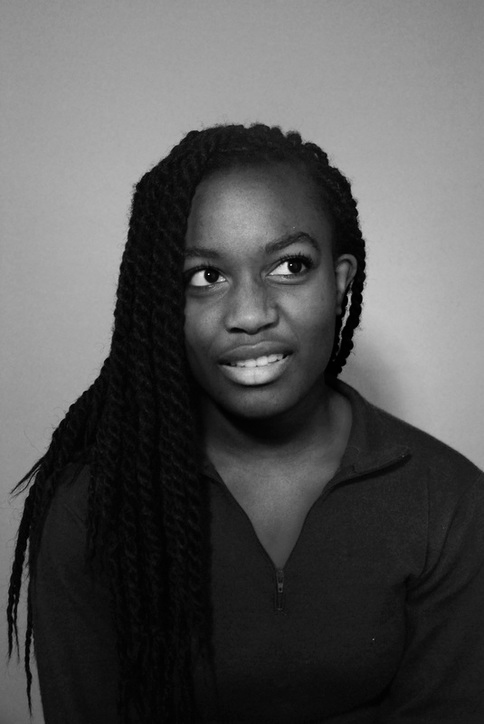
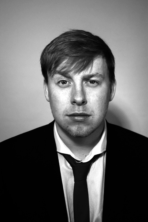
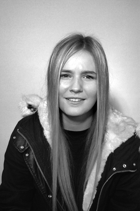
By editing my original images into black and white, I have enhanced the contrast between the tones of the pictures. This contrast allows specific features, such as freckles, to stand out more and become a unique feature of the picture itself. Although I like the dramatic style the black and white contrast gives, I prefer the coloured pictures as it adds more character.
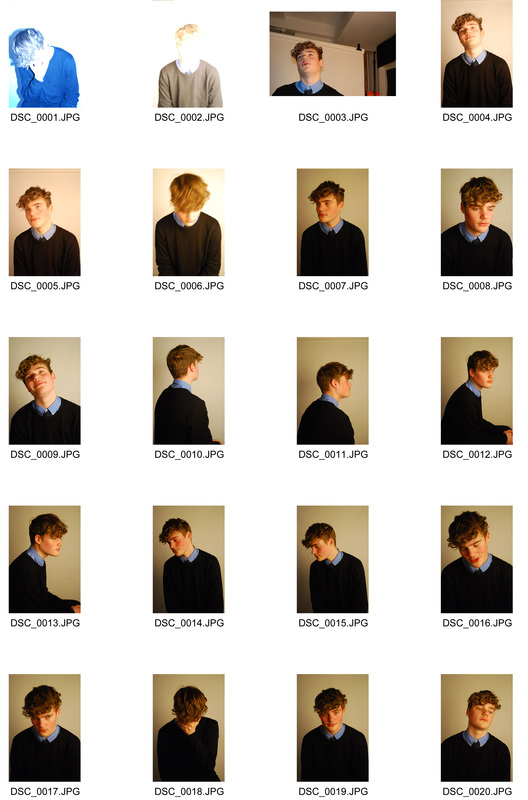
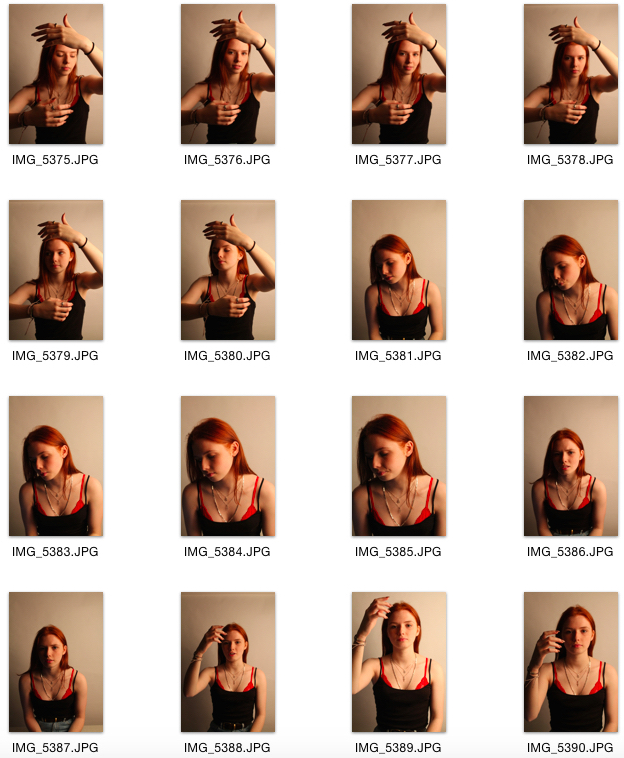
Experiments with Studio Lighting
When it comes to portraiture, photographers would want a lot of control over the lighting. The lighting is the first thing you notice in a portrait, so using it to create the right mood and highlighting specific features is essential for photographers.
Studio lighting can be set up anywhere. It's not only used to create a brand new artificial light source, but it can also enhance natural light.
REMBRANDT LIGHTING is a single light source used by photographers to create a sombre or dramatic effect. This type of lighting is extremely distinctive as it creates a small triangle of light underneath the subjects eye. The lighting itself is very strong, so it creates a harsh light on the subject, adding to the dramatic effect the photographer might want.
Below are some examples of rembrandt lighting taken in class.
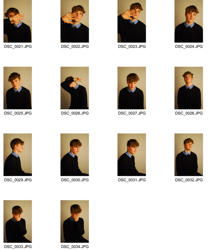
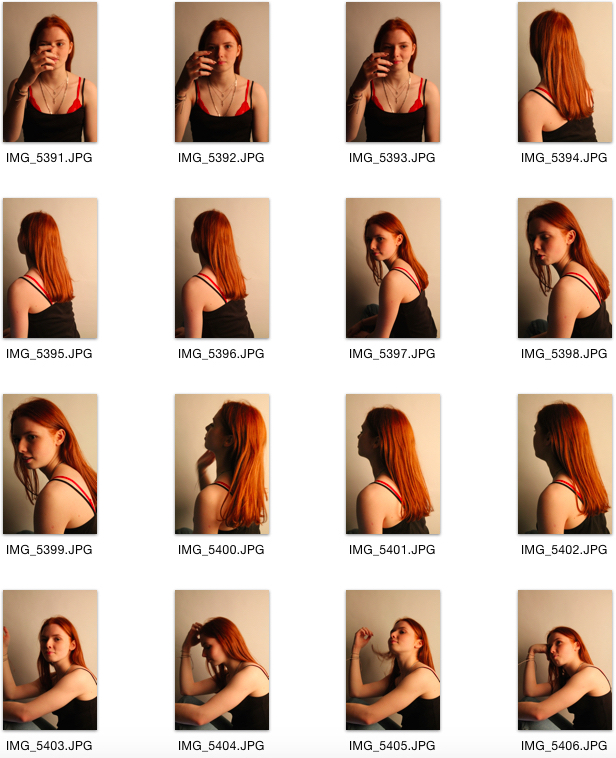
BUTTERFLY LIGHTING is also a technique created by one light source, which is place directly in front but slightly above the subject. It is distinguished by the small butterfly shape shadow the lighting creates underneath the subject's nose. Like rembrandt, it also creates a dramatic mood; however, it is more subtle, as the light is more diffused in comparison to rembrandt.
Below are some examples of butterfly lighting taken in class.

SIDE AND EDGE LIGHTING are both techniques that use one light source to give a harsh and dramatic shadow on the subjects face. This allows not only the shadows to be dramatic but the mood of the picture too.
Below are some examples of side and edge lighting taken in class.

BACKLIGHT is a light source behind the subject which creates a sort of "halo" effect and highlights the subjects face shape. This lighting is achieved by positioning the light behind the model and pointing it at the backdrop.
Below are some examples of backlight taken in class.

Additional lighting techniques:
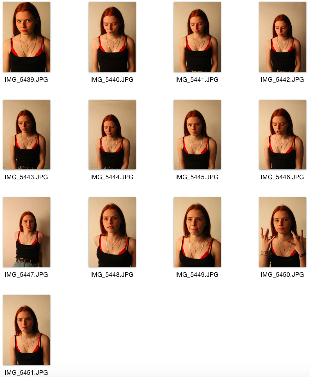
SHORT AND BROAD LIGHTING are known as yin/yang lighting. They allow you to get two completely different lighting looks by simply rotating your subject 180 degrees. In Short Light, the subjects shadow is facing the camera, whereas in Broad Light, the side of the subjects face with the most light faces the camera.
SHORT AND BROAD LIGHTING are known as yin/yang lighting. They allow you to get two completely different lighting looks by simply rotating your subject 180 degrees. In Short Light, the subjects shadow is facing the camera, whereas in Broad Light, the side of the subjects face with the most light faces the camera.
Lewis Khan


Georgetown by Lewis Khan is a series of factual portrait images following a man named George from South London. In this series, Khan not only takes pictures of the local resident and character Pat, but other things as well that represent Pat and his life. In the pictures taken of him, Pat is in the centre of the photograph, showing central focus. Khan also uses aperture to make Pat the focused part of the picture, while the rest is blurred out. Both of these techniques make it clear that Pat is undoubtedly the subject of the series, including the images in which he does not actually appear. This brings us to the fact that Khan captures images of Pat's belongings and his environment. This is important because you wouldn't normally associate this with portrait photography; the pictures reveal the type of person Pat is by the things he decided to surround himself with.
Another thing that shines through with the photographer's techniques is the relationship between Pat and Khan. Khan's subject matter is very close to the camera, reflecting the closeness he might have with Pat, and also the fact that this character might be a very open person too. These images are a true representation of Pat; nothing has been distorted within the picture, which shows that we are experiencing a true and intimate insight into Pat's life.
The mood throughout the series is quite somber. Some of the pictures are very dark and under-exposed, creating a reflective mood. The pictures taken outside make it seem as though Pat is a very relaxed person, and he takes life slowly. This is emphasized by the fact that he is standing still in an image while the cyclist in front of him is blurred as a result of the speed he is moving at, a technique created with a slow shutter speed.
I particularly admire this series by Lewis Khan because i'ts not the typical portrait photography you would normally find. Khan has found different ways to portray an individual, and he has done it in a true and honest way, something which I think is very hard to do as we usually try to show our own impression of someone, rather than show them and their true colours.
Practical response to Lewis Khan - final selection of series
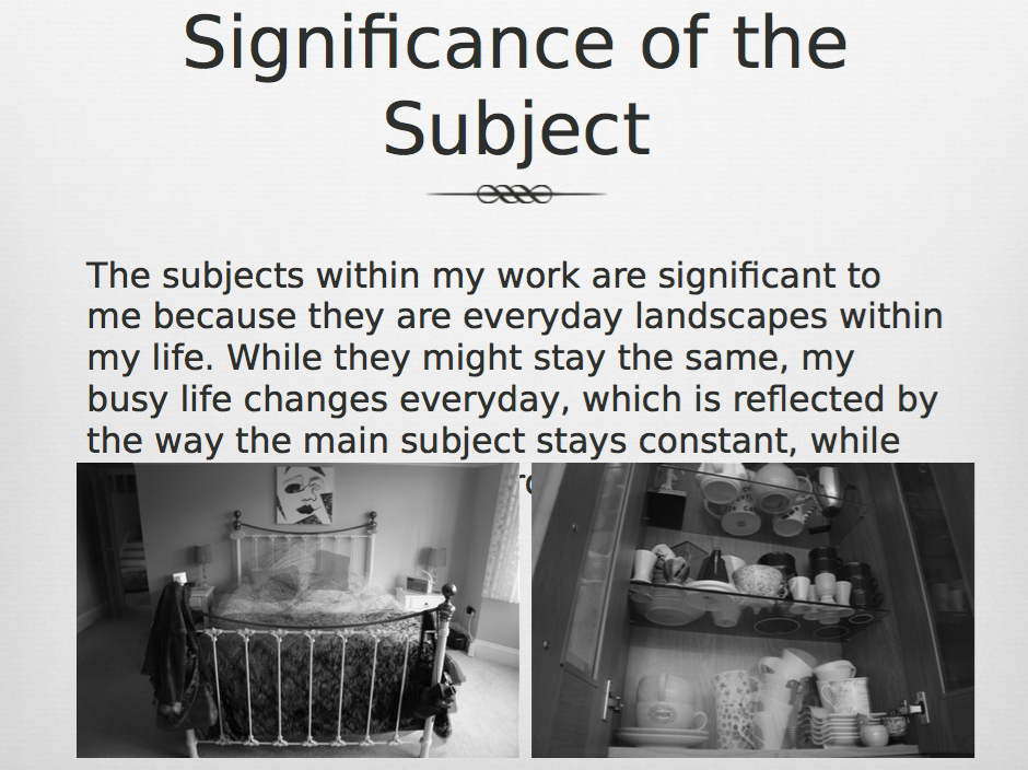
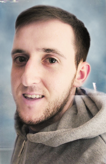
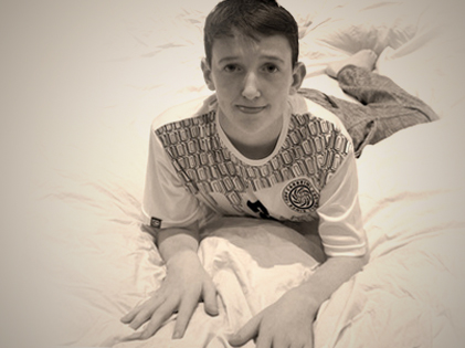
My subject is my little brother, Ollie. I decided to take pictures of him because he's currently just starting secondary school, so I wanted to capture this new beginning in his life and how this affects his personality and the things he loves. I wanted to show an atmosphere of 'new beginning', and that Ollie is almost experience a fresh start in his life. This sort of atmosphere is suited to him because of his age (11 years old) and what he is going through in life at the moment. To achieve this atmosphere I have made sure I focused on lighting and making my pictures quite bright, but not too bright. I wanted to get a dewy feel to the photographs, to make it as if the audience can feel the 'freshness' and feel like there is a weight being lifted while Ollie leaves the old behind, and starts the new.
While I believe most of these shots depict my little brother quite well, there could be improvements made. Firstly, the framing of some shots could be worked on, such as the photograph of the red books. Maybe if I had zoomed out to allow the audience to see more information, this would allow them to gain a greater understanding of Ollie, and improve the picture as an individual too. I also need to be more consistent with the type of lighting that I use. In some pictures I use soft lighting, whilst in others I use flash which is very harsh and doesn't create the dewy atmosphere that I wanted to achieve. However, in some of the shots, I feel as though I have been successful in terms of composition.
Landscape Photography
Landscape photography is a way of allowing photographers to capture specific environments they happen to find themselves, in and how they uniquely perceive them to be. Photographs can not only capture nature in itself, but man-made aspects of the world, such as buildings or even world disasters.
Experimenting with the Formal Elements


The Formal Elements

Lines within a photograph usually create a sense of peacefulness and consistency. Layers of multiple lines within a picture creates drama and rhythm, which is appealing to an audience.

Form is a 3-D shape that is best shown through side lighting because of the soft shadows it adds. The difference between light and shadow gives us a better understanding of the depth of an object and it can also portray a meaning or a message too.

Pattern is shown within a picture by emphasising it, or breaking it. To emphasise it, you can expand it or even zoom into it, to break it you can find objects to interrupt it and make a distraction.
|

Shape is the second most fundamental element of design because it is a key aspect of recognition.

Texture within an image is mostly based on light. Depending on the light, it can affect the way a texture is seen, therefore affecting the emotion portrayed.

Colour can affect a shot in both good and bad ways. The different colours portray different messages and meanings behind them, so they have important visual representation.
|
Nadav Kander

Nada Kander is a landscape photographer who, in this instance, focused on photographing todays remains after the Chernobyl disaster. This disaster happened in 1986 in Ukraine, and Kander got the chance to go to the site and photograph it for himself.
Without even look at any of the photographs in the series, the first thing that is instantly striking is the name Kander decided to use. "Half Life" not only refers to the use of radioactive atoms, but it is also emphasising the fact that the people living in the area might have only lived half their life. As we see in an interview with Kander, a woman living near where the disaster explains how 40 year old men and women are dying as a result of the radioactivity. This is a young age to be dying at. Here, Kander has cleverly referred to the factual, scientific side of what happened, but also the emotional, disastrous side too.
Throughout the series, Nadav Kander photographs different areas that were and still are affected by the disaster today. One photograph in particular, called "Classroom, Secondary School, No. 1, Pripyat", stands out. The name of this photograph also has significance because it is the location of the photograph. Kander isn't dressing anything up; he's making it clear that the audience can see that it is a factual image and that this disaster actually happened. The photograph itself is of a classroom that looks as though it has been abandoned. The desks and chairs remain in place which make it seem as though everything has literally just been left, as if time just stopped there are even classroom resources, such as a globe, on the table still. The only thing that might have changed is the wallpaper; it is peeling and fading away, like the memory of this place, and of the disaster. To get the images that Kander wanted, he used a view camera to capture his images. This detaches him from the moment and into the image, so he gets a real emotional connection and can portray that into his photograph. He does this in order to be extremely analytical of his images, as he would want to make sure they are honest and that they create specific emotions when looked at. The lighting he uses is natural; the only source of light is from the windows. This soft light highlights the room, emphasising the debris and the devastation.
Discovering Formal Elements at Alexandra Palace


|
This specific image I took whilst at Alexandra Palace I believe is particularly successful because it really emphasises the formal element of shape. As you can see, the grand windows that Alexandra Palace display are a very unique shape, allowing shape to be explored. In this photograph the arch shape the windows make is complimented by the use of lighting and colour. The blue sky really compliments the shape of the window and the white light that seeps in creates a contrast to the upper foreground of the picture, again, allowing us to see the definition of shape. The contrast also makes the image more dramatic and interesting to look at. |
|
Another formal element I explored whist at Alexandra Palace was the element of lines. The picture to the right is successful in portraying this element well. The vertical direction in which the line travels is very effective within the picture; these columns are showing an intricate detail of the palace. The way the line carries on right to the top of the picture is effective because it curves round which really shows how the line is travelling within the picture. The lighting within the picture really compliments the lines because it creates a contrast from the bright windows to the dark shadows of the lines. It also allows us to appreciate the complex detail of the capitals on the columns. This emphasises the effort that was put into decorating the magnificent building and the history behind it too. |

|
Analysis of Idris Khan
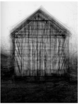
Idris Khan is a landscape photographer from Birmingham. He was born in the UK in 1978. Khan completed a Master's Degree in Research at the Royal Academy of Art in London 2004. After doing so, he has acclaimed great recognition from his powerful and emotionally charged photographs. Khan's unique technique of creating heavily layered images to produce a chaotic scene is extremely well loved within the art world. Personally, I like Khan’s work because it can come across in many different ways. Some could say that they are factual images, whereas others, like myself, would say they are more personal images that reflect the photographer on a deeper level. As a result of this deep involvement within the pictures, I find them very enjoyable to analyze.
This specific photograph, which is shown on the left, depicts a building that may have been significant to Khan. He has obsessively captured repeated images of one location and has complied them into a stacked pile of semi-transparent layers in order to make the overall image very chaotic and messy. Khan is almost giving us an overload of information, which does create chaos, but within this chaos we see the simple, basic nature of the building. This could possibly be symbolising the significance buildings have in our landscapes and how although we are surrounded by chaos, the buildings always stay the same and almost represent factual information; the constant buildings and landscapes that have been and will most likely always be in our lives. The highly contrasting gray scale effect that Khan has used gives the image a ghost-like and transcendent feel to it feel to it, implying that this place might bring back certain dark memories to him. It also makes it harder for the viewer to identify what type of building this is, adding to the mystery of it all and implying that it might not always be noticed. This can be linked to the fact that Khan places multiple images on top of each other. It’s as if he desperately wants the image to be noticed, so he has to capture it many different times in order to do so. If Khan simply took one picture of it, it might go unnoticed because it is like the everyday, ordinary buildings we see.
The process in which Khan went through to take these images would have been the more seemingly simple part of the overall method. Khan would have taken these images from a book and scanned them into his editing software, treating each scan as an individual photograph that he uses to layer on top of the next. From here, he adjusts the tonal qualities and contrast of each image, once again, making them all individuals. The more technically challenging part of the process would have been the editing stage. After digitally uploading them, Khan would have played around with minute variations within each layer, such as the contrast, brightness and opacity. This allowed Khan to have full control, he could manipulate the pictures to whatever extent he wanted, in order to gain the haunting feel that he wanted. The editing process would have been significant because Khan might have wanted viewers to see these buildings in the way that he was seeing them.
Within the image, the most obvious formal element that shines through from most of the photographs is the element of lines. The lines draw our attention to the buildings straight away and guide us to carefully and analytically consider the physical, simple building it is. Not only do we see the factual architecture, but the landscape around us and how that might have an emotional impact on our lives, even if we don’t realize it. Another element Khan uses is shape. This is an extremely important element to have, especially with the technique Khan has used, as the buildings might not have been identifiable. The use of both bright and dark light compliments the identification of the buildings and the use of shape.
Although this work may not be the typical type of landscape photography you would see normally, that doesn't mean that it doesn't connect with the overall project. These series of photographs that Khan has produced depict a landscape that is possibly personal to him, which is something I am inspired by. Khan is stressing the fact that each person can have their own unique landscapes, and the simple, yet complex meaning they might have in our lives. The reason Khan’s images have such an impact compared to a regular still landscape image with one layer is because Kahn’s seem to flicker and pulse with life. It is as if the image is jumping out at you, whilst also creating a reflective atmosphere. An ordinary picture, however, can seem slightly boring and might not have the same emotional impact as Kahn’s work.


Practical Response to Idris Khan
Landscape Photography Evaluation
|
|
Documentary Photography

|
|
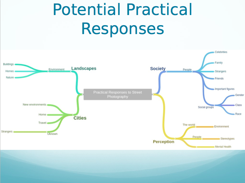
Planning My Practical Response
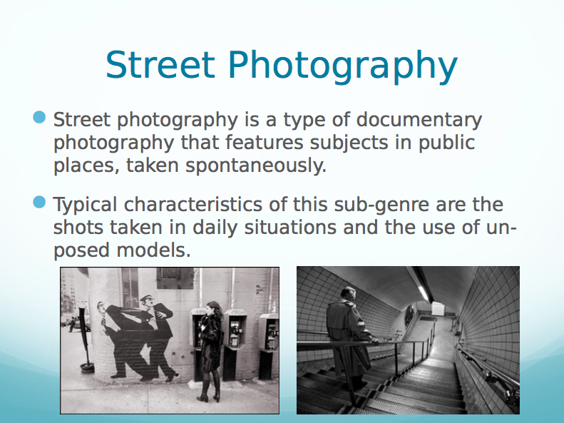
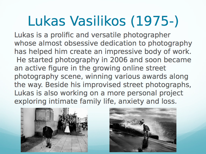
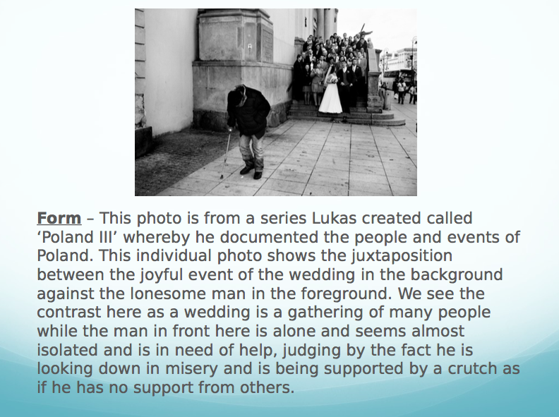
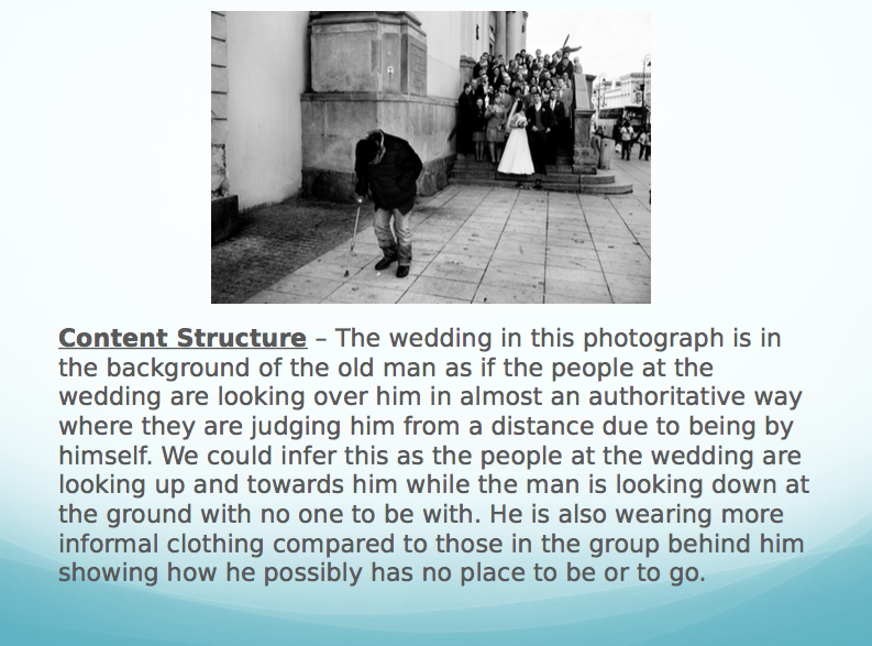
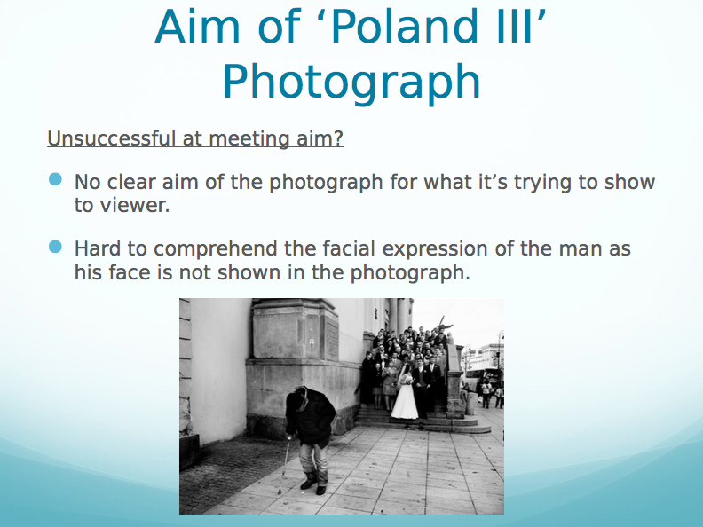
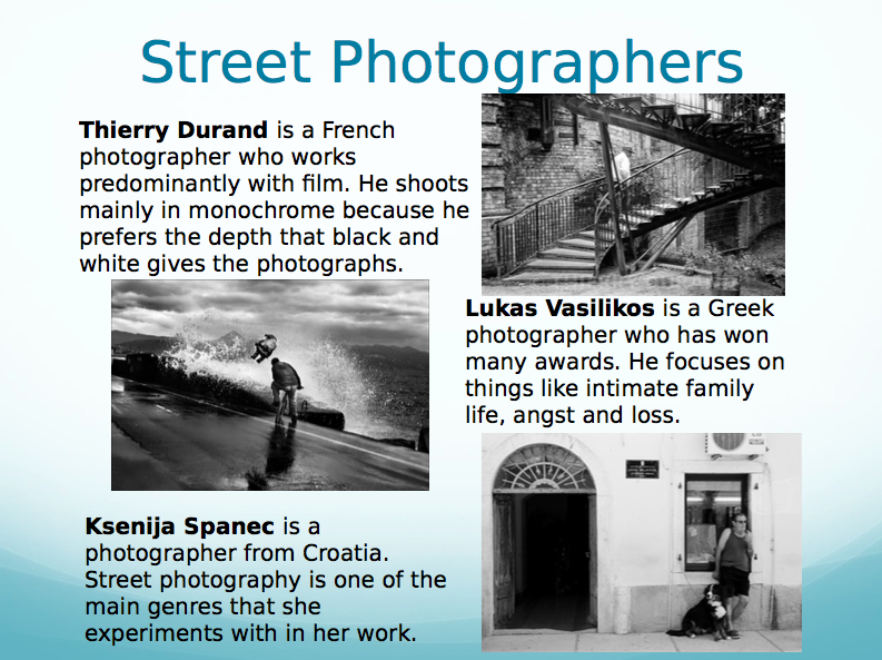
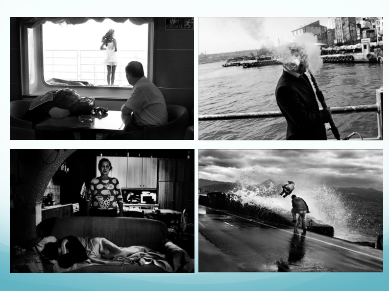
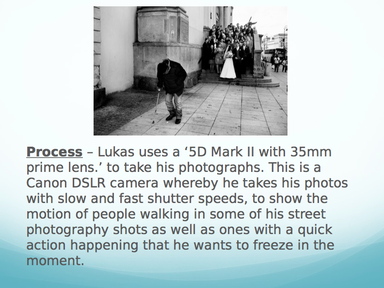
A particular element of social documentary photography that I found interesting and inspiring is that fact that even if a photograph is candid it can still be personal, while having a general meaning too. Lukas Vasilikos, although he is a street photographer, is especially inspiring because through his pictures, he shows how a specific culture of society live and their views on certain people within it. His photographs are technically successful because the black and white effect make them dramatic and interesting. He also makes us focus on specific parts of the pictures and we therefore think about the deeper meaning of it.
My intended practical response is going to be focusing on stereotypes within society, especially in terms of gender. I will look particularly at stereotypes within the house hold. I intend to convey the stereotypical views that people in society might have on people of a certain gender. I want to evoke a feeling from the viewer that might make them feel guilty for viewing people in this stereotypical light; this might teach people to sway from these views and see that everyone is equal no matter what gender they are and how they live their life. While shooting, I am going to be looking out for specific symbols that might evoke these emotions from the viewer. I am going to use a black and white effect on my pictures; this will ensure that they are very dramatic and that the audience is not distracted by colour, but really think about the deeper meaning behind the photographs. Another reason I am going to edit my pictures in black and white is because stereotypes are described as being very "black and white". This means that they are very fixed views on these people, and these views might be difficult to change.
My intended practical response is going to be focusing on stereotypes within society, especially in terms of gender. I will look particularly at stereotypes within the house hold. I intend to convey the stereotypical views that people in society might have on people of a certain gender. I want to evoke a feeling from the viewer that might make them feel guilty for viewing people in this stereotypical light; this might teach people to sway from these views and see that everyone is equal no matter what gender they are and how they live their life. While shooting, I am going to be looking out for specific symbols that might evoke these emotions from the viewer. I am going to use a black and white effect on my pictures; this will ensure that they are very dramatic and that the audience is not distracted by colour, but really think about the deeper meaning behind the photographs. Another reason I am going to edit my pictures in black and white is because stereotypes are described as being very "black and white". This means that they are very fixed views on these people, and these views might be difficult to change.


By looking at my first series of pictures, I have been successful in portraying the stereotypical view of gender. I have done this by capturing the typical symbols that someone of a certain gender might be associated with, such as colour. Although I did this successfully to some extent, I did find it very difficult to produce these photographs. The genre as a whole is very difficult as everyone can interpret the pictures in different ways. I am aware that there are many ways in which I can improve these pictures; I should vary my series by taking more zoomed out pictures, showing a whole setting instead of just small details. I should also be careful when editing; making sure that when I remove the colour of the picture that I don't do it so much that I take away vital information. These ways of improvement will make the images more dramatic and will work better as a series. The adjustments will also help keep the viewer interested and will help create the narrative that I haven't achieved here; this will then able me to evoke emotion from the viewer too.
Reshoot of Practical Response
The reshoot of my landscape photography series, I believe, was much more successful than the first. My first shoot didn't have a clear narrative to it; it lacked clarity of what the photographs were actually about and how they were supposed to portray a gender stereotype within the household, there was no consistency to the series. In my reshoot, I ensured that the typical stereotypes of the females of the house doing all the housework and the males lounging around relaxing were heavily present. I also depicted the males as business men by capturing the office in my own home that my father uses to work in. This once again enhances the stereotype of the business man and the housewife. My aim was to make this pictures make the viewer feel guilty about viewing these characters in this way. If a woman wanted to, she can go out and work and should feel fret do so. If a man wanted to stay at home while his wife works, that is also totally acceptable. The main message I was trying to push across is the fact that everyone is equal. Therefore, we should all have equal opportunities and feel as though we can achieve anything we want to without feeling oppressed.
Personal Investigation:
The "Iconic"
After experimenting with portraiture, landscape and documentary photography, I have chosen the word 'iconic' to explore as an independent study. This word is significant to me because not only do I have icons in my everyday life, but I also have icons in terms of music and stylistic manners. Music and fashion have always been very keen interests of mine, so choosing the word 'iconic' will allow me to incorporate this passion into my photography. I am lucky to live in London where the music and fashion scenes are so vast and vibrant as it is one of the busiest and most diverse cities in the world. This also means that I am surrounded by a multi-cultured society, meaning that I have access to unique individuals with different styles and ethnicities and I am able to ask questions about society by using this word and the type of people within it. I am eager to develop my ideas on icons, not only within society, but within a person's life too. I have brainstormed my initial ideas below.

Gillian Wearing
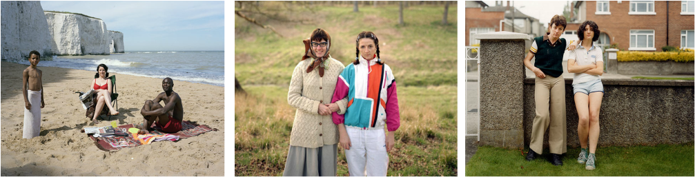
Gillian Wearing's work is inspirational to me because she captures the honesty within everyday people in society. This series of photographs, where she asked random people in the street to write an honest comment about themselves, shows how we see different types of people everyday, however we don't know how they're feeling on the inside or what their lives are actually like. I like the fact that Wearing has used a disposable to achieve these images, as the technical elements of the photos can then reflect the honesty they portray. As a response, I intend to use the same technical elements as Wearing, and make sure that I portray the same theme of honesty of society within my photographs. This ties in with my project because I believe that even if a person isn't well-known in the public eye, they still contribute something to society and create diversity; this makes every individual an icon of society, especially their own. Below are some examples Wearing's series called 'Signs that Say What You Want Them To Say and Not Signs that Say What Someone Else Wants You To Say' from 1992-3.
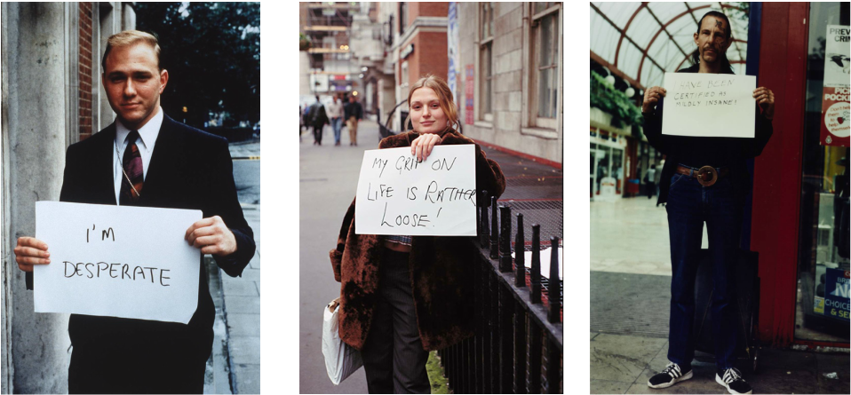
Gillian Wearing is an English conceptual artist, born in 1963 in Birmingham. Her series 'Signs that Say What You Want Them To Say and Not Signs that Say What Someone Else Wants You To Say' captures strangers that Wearing has met on the street. Wearing asked these people to write down an honest comment about themselves and hold it up for the camera, giving us an insight to these strangers lives, that we might not have expected.
The pictures themselves are quite simple in the fact that they are just portrait pictures of men and women holding up a piece of card. However, the framing of the photographs vary; this could be done deliberately to express how honest the person was being. In some of the pictures, we have to physically look closer in order to understand what the paper says. This is a reflection of life in general, sometimes we have to get to know someone more in order to understand them and why they're the way they are.
Wearing wanted us the capture the unknown aspects there are to society, and the honesty of the strangers behind the paper. She did this by allowing the subjects to pose normally, as if nothing was wrong, when really they have a lot going on in their lives. This relates back the saying, "never judge a book by its cover" because thats what most people do in everyday life towards everyone they see. These pictures make us realise that we might never truly know how someone is feeling, simply just by looking at them. For example, the centre image of the beautiful young girl depicts her as being quite content; you wouldn't expect her to have written what she has written down on the paper that she's holding. The way the woman is posing indicates that she is very careless and relaxed; however, the word she has written on the paper suggest otherwise.
The processes that Wearing used to create these photographs reflects the concept of the pictures. Using analogue photography and printing them from film emphasises the honesty of the pictures. Instead of capturing them digitally and editing them a specific way to make the audience view things in a certain way, Wearing prints the pictures to enhance the brutality of its honesty.
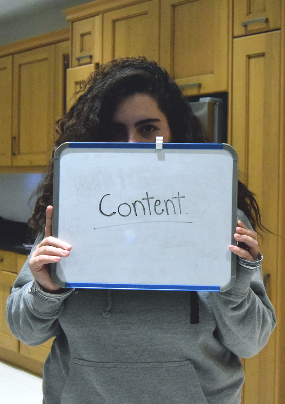
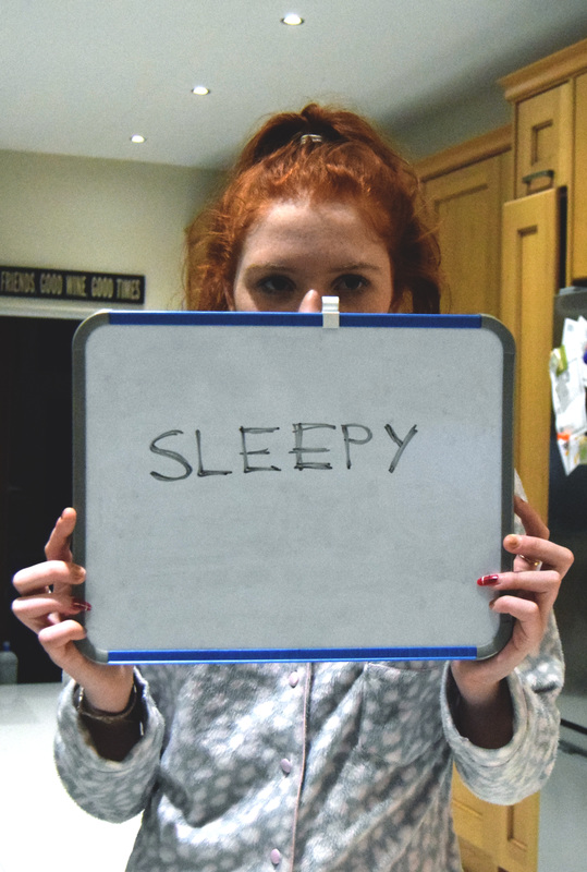
Practical Response to Gillian Wearing: First Shoot
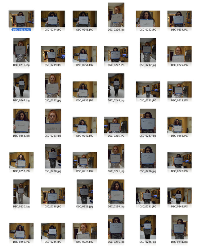
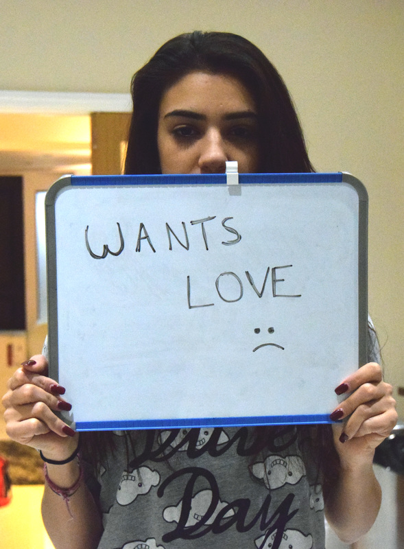
Below is the first contact sheet I produced from my first shoot of the Gillian Wearing practical response. Unfortunately, not all of the pictures that I took with the disposable camera printed out; however, this will allow me to reshoot and refine some elements of the pictures. Firstly, the pictures are quite dark, I can improve this by placing my subject in a well-lit environment in order to get a clearer picture and also make what is written on the whiteboard more obvious. This will allow the viewer to see the image more clearly, which will then evoke the tense emotion that I am aiming to achieve. I also want to use a wider range of people, like Wearing did.

Reshoot of Gillian Wearing Response
In this shoot I have used a digital camera instead of a disposable one. Although the concept of the disposable camera goes with the shoot and the deeper meaning of it, the disposable camera can be quite unreliable. I decided to use a digital camera in order to get a better, more clear photograph. A successful part of this shoot is the range of people I have used. This creates diversity and keeps the shoot interesting. However, next time, to make the shoot even more interesting and to push myself, I want to go out and used strangers for these type of photographs. This would result in a more interesting set of photographs.
Gillian Wearing Practical Response: Edits
A successful part of my Gillian Wearing edits, I believe, it to contrast within the photographs. I like how they look dramatic but still have a subtly to them. To make them look slightly like disposable picture, have added a slight white wash to them. However, I didn't want the pictures to loose their interesting colours too much, so I only did this slightly. To make this images more unique and to add some of my own individual creativity to them, I could make them black and white to dramatise the photographs. This would link to the deeper meaning of the images and make them more interesting.
|
|
|
Trish Morrissey
This series of Trish Morrissey's work captures her way of remaking old family photographs in the modern day. This interests me because she is remaking iconic moments within her life, which I would like to attempt as well. This will allow me to explore a different side to my focus of "iconic"; instead of looking at iconic figures, I will be looking at iconic moments within history. Morrissey sets the scene of her photographs by using key props and costumes to reflect it back to old times. As a practical response I will recreate pictures that depict moments in my life using props and lighting to get the same effects. I will also use the editing process to really enhance the age of the photographs and even use the old images to help create this.
Below are some examples of Morrissey's work that I will take influence from in my response.
Below are some examples of Morrissey's work that I will take influence from in my response.
Practical Response to Trish Morrissey: First Shoot
The pictures I have taken with inspiration from Trish Morrissey have some successful aspects to it, and other aspects that could be improved. An aspect that I believed to be successful was getting the models for my photographs. Each person in the retake is the actual person from the original photograph; this is also the case in Morrissey's series. This emphasises the difference in time between the old and new photographs and how iconic memories will live, but people will grow, change and fade. I believe I could have improved on achieving the correct lighting for my pictures. Using flash was not the best lighting to have as it makes the image harsher and less like the original image. One thing that Morrissey does utilise extremely well is costume. She dresses her models in extremely similar costumes to the original images, which is effective in remaking them. In my images, I could have dressed my models in better costumes in order to make the photographs more similar and more atmospheric too.

Practical Response to Trish Morrissey: Second Shoot
I decided to reshoot this response in order to gain more photographs to choose from and to improve the way I framed the shots and my use of lighting as well. By looking at the photographs I am aiming to remake, the framing of the shots has definitely been improved. The shots look more like the original photographs which is my main aim. One thing that can be improved with this shoot is the use of lighting. Although its an improvement from my last shoot where flash was used and made the image look artificial and washed out, the lighting isn't exactly similar to the original photograph. For example, for some shots need to have a whiter light used, instead of a yellow light.

|

|
Practical Response to Trish Morrissey: Edits (First Attempt)

|

|

|

|

|


|
|

|
The final edits I have made have elements that are successful, but also some parts that could be improved. One aspect I believe I was successful on was the positioning of the models and getting to models to do a similar pose as the old photograph. This positioning makes it obvious that I am aiming to remake the photograph and emphasises the iconic moment that has been captured in the old picture. One thing I could improve on is the editing process I went through to achieve these final outcomes. While the composition of the photos may be done well, the colours of the photographs do not match the original, making it seem more modern and less like the original. I feel as though my weakest image is the final one. I should have shot my subject at a lower angle and edited the picture with more sepia tones to get a more similar image. In the third picture, I have dressed my model in the school uniform that he currently wears, while in the original photograph, he is wearing the school uniform he would have worn when he was younger. The reason I have deliberately done this is to emphasise the change that, not only the subject, but everyone goes through in life. While we might still have these iconic moments captured in our memories, life moves on, things change and people grow.
By using elements from the original photographs that I was remaking, I was able to create a dated look to my images, making it obvious that I was trying to remake the photographs. I also improved on finding the correct tones and colours that matched the original photographs. This is not like the first attempt where one photograph was in black and white yet the original had sepia tones to it. These edits really capture the time the photograph was taken; although they might have a slight modern twist to it, it is evident what my aim was and creates a clear juxtaposition between the times and shows how iconic that moment really was in a specific person's life.
By using elements from the original photographs that I was remaking, I was able to create a dated look to my images, making it obvious that I was trying to remake the photographs. I also improved on finding the correct tones and colours that matched the original photographs. This is not like the first attempt where one photograph was in black and white yet the original had sepia tones to it. These edits really capture the time the photograph was taken; although they might have a slight modern twist to it, it is evident what my aim was and creates a clear juxtaposition between the times and shows how iconic that moment really was in a specific person's life.
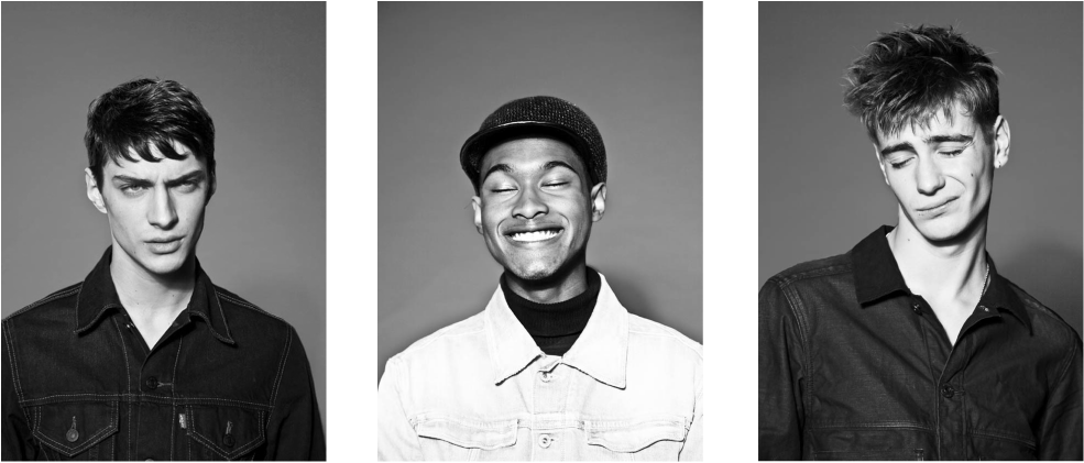
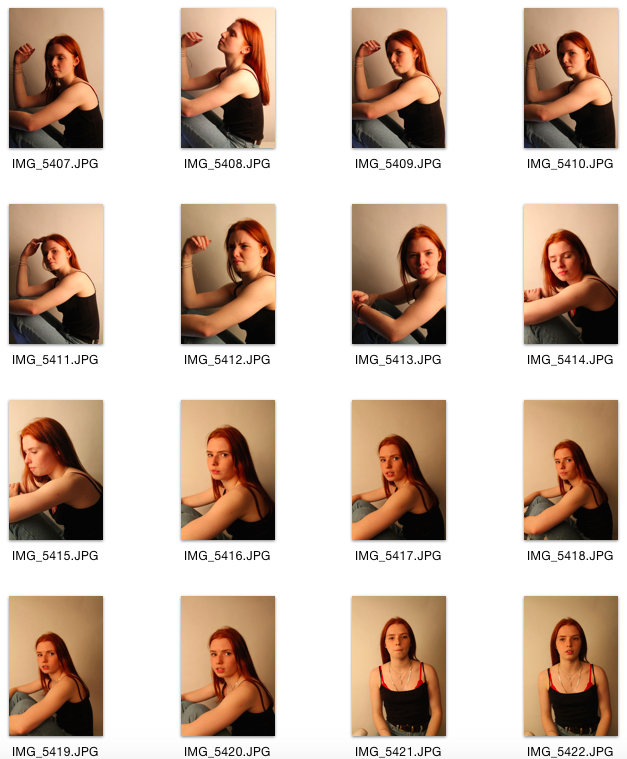
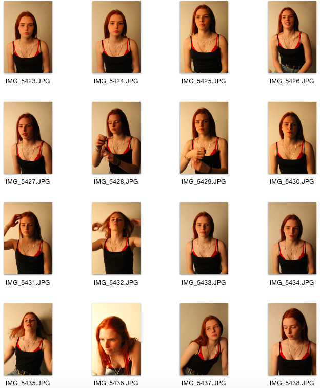
Anna Victoria Best
In this series that Anna Victoria Best shot for i-D, she captures the subject's personalities within one picture. By doing this, she is emphasising the diversity within society and the uniqueness that each person brings to the world. This is inspirational to me because as a practical response I want to capture the unique personalities of each of my friends, and how they are iconic to me. The close up frames and the black and white colour scheme that Best uses will help me achieve my aims because they make the photographs seem more personal. This will reflect the relationship that I have with the model and what type of person they are.
Below are some photographs from Anna Victoria Best's i-D Magazine shoot that I will take influence from in my response.
Below are some photographs from Anna Victoria Best's i-D Magazine shoot that I will take influence from in my response.
Practical Response to Anna Victoria Best: First Shoot
These pictures show the inspiration that I attempted to reflect from Anna Victoria Best's work. While these pictures have some successful aspects to them, they also could be improved greatly. For example, at first, I couldn't seem to grasp the correct lighting and use it effectively in order to gain to brightness in which I wanted to capture my subjects in. This is reflected in the vast variation of lighting these pictures have; some are extremely light, while others are darker. One thing I think I portrayed well in these pictures was the concept of the photographs. I wanted to capture the personality of all of my subjects, and I think I achieved this effectively.


Practical Response to Anna Victoria Best: Second Shoot
In these photos, it is evident that I achieved the lighting that I wanted as it is more consistent throughout the photographs and they portray the subjects in a better way. The subjects faces can all be seen, which means my intentions of portraying their personalities through the pictures is successful. Although these pictures are an improvement from the first shoot, they can still be improved by making sure I don't create any unwanted shadows on my subject, for example, there is a shadow under the chin in most of the pictures.


Practical Response to Anna Victoria Best: Edits (First Attempt)
Looking at these images, I think they are good for a first attempt at being influenced by the lighting, composition and edits that Anna Victoria Best has used. However, they can be improved greatly. Firstly, the quality of the photographs are not of high standard, which instantly creates a poor looking image. While I like the poses of my subjects, the framing should be tighter to gain a similar look to Best's; I need to turn my camera portrait to achieve this. The contrast of my images could also be also higher in order to gain a more dramatic look.

|

|

Practical Response to Anna Victoria Best: Third Shoot
In this shoot I was aiming to get a clear and consistent lighting and frame in order to make make photographs more focused and therefore more visually appealing. By keeping the lighting and frames of my photograph consistent, I am being influenced by the work of Anna Victoria Best more closely and reflecting the relationships between a photographer and a subject that she depicts. This links to my chosen word 'iconic' because my photographs are of friends, who are everyday icons in my life; no matter how close or not I am to them, and no matter how long I have known them for, they have influenced my life in some way and built who am I as a person. These pictures are a big improvement from my previous shoots, mainly because of the consistency among the technical aspects.

|

|

Practical Response to Anna Victoria Best: Edits (Second Attempt)
These final edits that I have produced after re-shooting are definitely an improvement. Firstly, all the images are in focus, and they are more consistent in terms of framing too. Also, the quality of the photographs is much better, meaning it is a clearer shot, and the black and white edit doesn't make the image look worse. One thing I could improve on these images is the actual editing process itself; I could make the images stand out more by enhancing the contrast, this will make the images less 'flat' and will attract viewers and make people more interested. The main focal point if the photographs is the contrast; although it could be slightly higher like Best's photographs, I didn't want to make too high in contrast that it would make the pictures seem too artificial or over edited. A fun, playful, light-hearted mood is created in throughout the pictures with the poses of the subjects. The use of black and white takes away any distraction and really allows the viewer to gain an insight into my subject's personalities.
Overall, I think these images have definitely developed my investigation and also my ideas for the future. They have allowed me to realise that studio photography is definitely something that I am interested in and want to use more throughout this project.
Overall, I think these images have definitely developed my investigation and also my ideas for the future. They have allowed me to realise that studio photography is definitely something that I am interested in and want to use more throughout this project.
|
|
Reflection of Work So Far...
In my investigation so far, I have mainly been focussing on portrait photography which I aim to continue to do further on in my project. However, by experimenting with studio portrait photography in the Anna Victoria Best shoot, I realised that I want to head towards that path more. This brings out my interest in fashion and can therefore link the glamorisation of fashion and photography together. In terms of context, I have been looking at more personal icons, but I want to venture out and look at social icons and what makes a social icon.
Flora Borsi
Flora Borsi is a portrait photographer that creates technically accurate images and edits them to produce an element of mystery or the unknown. Borsi's work will help me further explore my investigation because the use of studio portrait photography allows the viewer to focus the subject, making them an icon of that specific photograph. The editing process will also push my project further because it creates the idea that we don't truly know the subject properly; something is hidden, just like the icons in today's society; we don't always know the truth. The actual idea of something being "painted" over can be linked to this part of my project because I am exploring the idea of something being obscured, but I could also move this on to something being faded away too.
Not only do the contextual aspects of Borsi's work contribute to my idea of the iconic, but so do her technical skills. For example, the framing of these images throughout the series are very similar; this gives off the impressions of consistency and continuity.
Not only do the contextual aspects of Borsi's work contribute to my idea of the iconic, but so do her technical skills. For example, the framing of these images throughout the series are very similar; this gives off the impressions of consistency and continuity.
Practical Response to Flora Borsi : First Shoot
This first shoot I produced in response Flora Borsi's "Ireel" can definitely be improved. For a first attempt, I think the framing is good; there are a mixture of tight frames and looser frames, just like Borsi's images. The lighting didn't start off well at the beginning of the shoot, but as I progressed it did become more consistent. However, to get a more precise photograph, I need to make the lighting more dramatic in order to create the sort of shadows and dramathat Borsi does. Personally, I also want to use a different model to create variety throughout my whole investigation.
|
|
Practical Response to Flora Borsi: Second Shoot
Compared to the first shoot, this is an improvement. I made the lighting more dramatic which created more dark shadows. The framing has been improved and is more consistent; the poses created by my subject are also similar to Borsi's images too. I could improve even more by creating a whiter, more brighter light; this will create a sort of angelic/ fuzzy effect that Borsi creates throughout her series. To make this response more original, I could take some full body shots. This will not only create variety within the response but it will also push my investigation of iconography further. By having full body shots, my subject will dominate the whole photograph, which will reflect the fact that icons sometimes dominate our own lives and some become obsessed with icons within society.

|
|
|
Practical Response to Flora Borsi: Edits
These initial edits reflect the style of Flora Borsi's "Ireel" series. The concept of something being obscured is shown through the edits by the use of the paint tool. The actual use of the 'paint' tool links to the idea of something being painted over or obscured, which is an aspect I am investigating within my project. Although I have created a high contrast within my photographs, like Borsi's, I could have changed the white balance on my camera settings in order to get the right type of light which would have created a colder tone to the photographs, like Borsi's.


|


|
|
|
Looking at the connection...


The images I have produced in the style of Borsi's "Ireel" have allowed me to largely consider presentation within my work. Boris presents her work as a series all together as one, so I decided to try this out for myself and see if it was successful. From the outcome, I have established that when work is presented as a series, the images connect with one another and interact. They allow the viewer to see them as a collection, yet as individuals too. This links to the idea of the iconic and more specifically "eclecticism". A series of images can be classed as a very special group and as I am looking at the iconic, eclecticism links extremely well. Borsi's use of a series of images has allowed me to think about the presentation of my final outcome too; by having a collection of images, I am showing how the iconic can be grouped as an elite, but also singled out in their own unique ways.
Marc Quinn
In terms of where I want to go next with my personal investigation, I want to stick with the use of portrait photography and explore the idea of iconography within photography and what impact this creates in society. I have enjoyed exploring icons on a personal basis, but now I want to investigate the icons we have within society and what impact they have on social beliefs and how we live and act as a society. Below are some examples of Marc Quinn's work, who I hope will allow me to look into these ideas.

|

|

|
Formal Analysis of Mark Quinn's 'Sphinx and Siren'

Marc Quinn is a British sculpture, some of his most famous work includes 'Alison Lapper Pregnant' and this series of statues he created of supermodel, Kate Moss, called 'Sphinx and Siren'.
The title 'Sphinx and Siren' is extremely effective. The word 'sphinx' is a term to describe a mythological winged monster having a woman's head and a lion's body, while a 'siren' describes a mythological woman whose singing lured sailors onto their island in order to trap them. This title could be reflecting the illusion that this statue creates; the gold material suggests something beautiful, but when you look closer, while it still may be beautiful, it's not as normal as you thought it might have been. Just like Odysseus' army in The Odyssey, you are lured in by the attractive nature of the statue, but with a closer look you can notice the strangeness of it all. This statue is made entirely out of gold. This actually makes me feel as though we, as a society, turn people into icons and create a hysteria around them.
The title could also be referring to how society build up these iconic figures to be something of an extraordinary nature; a creature with a woman's head and a lion's body is completely impossible, yet society still want to see it. This is just like the icons in today's society; although they are normal human beings, people still expect more from them.
The statue itself is extremely striking; it's not only the contorted yoga pose that makes it prominent, but the materials used too. Quinn states, "Gold is a metal that humans have decided is one of the most valuable materials in the world, but like their invented images of perfection, gold itself is a belief system; inherently no more valuable than any other metal". This material and Quinn's views relate back to whole idea of Kate Moss being an icon in society. Kate Moss is no different to any other human being, however, we as a society have created this belief that she is an image of perfection and so because of this, she should be treated differently and classed as more valuable.
Quinn also says about the work, "Human beings often create images, begin to worship them and then forget the images were initially invented by them. They are left with an abstract image that is impossible to measure up to. This is the basis of all celebrity and religious imagery". The sculpture really reflects this statement, because it shows that not only have humans created this belief about a single woman that should be worshipped, we have changed that person in both good and bad ways, and then forgotten about the idea and moved onto something different. This is also the case in terms of religion. Religious figures have been talked about for so long that they have almost been distorted in a way; this then causes them to be forgotten, the idea of them is abandoned and society has simply just moved on.
The siren sculpture relates back to my project because Quinn is showing this creation of belief of iconography through his work. This is something I am interested in looking at and aim to do so in my practical response.
Practical Response to Marc Quinn: First Shoot
In this practical response my aim was to capture everyday individuals and make them seem powerful by using the correct technical skills. Marc Quinn does the same in his series of sculptures; he makes Kate Moss, a normal human being, come across as a goddess-like being. In terms of my overall theme, the idea of creating icons and creating beliefs is largely reflected in this response. In this particular series of photographs, I think I did a good job of using low angles to make my subject seem more powerful. However, I think the pictures could be largely improved by creating a tighter frame; this will make my subject slightly closer to the camera which will give them an extra sense of power or influence. I could also change the lighting within the photographs too. A brighter light, or even a gold coloured light, will make my subject seem more divine and therefore more powerful and iconic. Instead of having my subjects all posing the same way, I could research different iconic statues and get them to recreate these poses in order to show variation throughout my photographs. I could research ancient Greek statues that have powerful poses; these statues were worshipped and can relate back to the mythological aspect of Quinn's work. This would, overall, show my subjects as iconic, supreme-beings.
|
|
Practical Response to Marc Quinn: Edits
These edits were done in class in order to practice the technique and to gain a clear idea as to what sort of look I wanted with my images. This editing process allowed me to realise that I want an element of mystery to my photographs, so having my subjects slightly covered with the gold material is effective in that way. The different ways of editing adds variety and diversity to the pictures; this makes them more interesting and fun to look at, viewers won't get bored of seeing the same style of edit with every photograph. The gold aspect relates back to how Quinn used gold, but also the concept behind it. Gold is believed to be one of the most expensive, supreme materials in the world; however, this is an idea created by society. This creation of belief is also relevant in ancient Greek times when the society at the time believed in all of these ancient gods and goddesses. This idea will be relevant when i have photographs of my subjects posing like ancient Greek statues, making this concept more understandable and applicable.


|


|
Analysis of Best Outcome
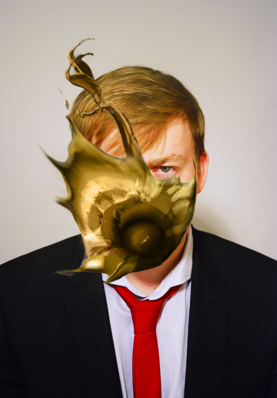
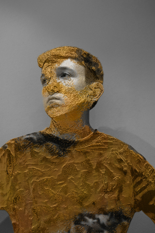
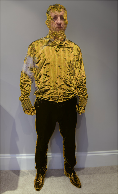
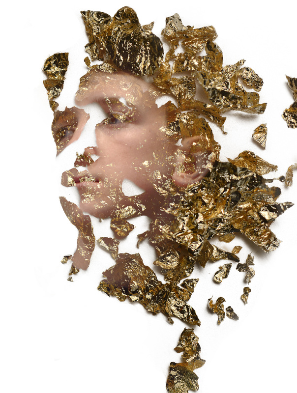
The reason I believe this edit using the chrome effect is the most successful is because I believe it links most to my investigation on the iconic and the idea of statues and putting figures on pedestals. The idea of moulding chrome into the figure that I want links to my exploration of how we perceive idols and how we create an image in our minds of how we want them to be; however, they might not always live up to these expectations. To represent this within my image, I have edited the image to make the chrome look as if it was melting or fading away, as if that person's true identity is trying to break free. Having said this, one could perceive this as the chrome taking over the figure, showing how people's perceptions and opinions can take over them and actually turn them into a person that they are not, but what they are expected to be. The reason the colour gold is used is to emphasise the rarity that these idols seem to behold as they are put on a pedestal by other people.

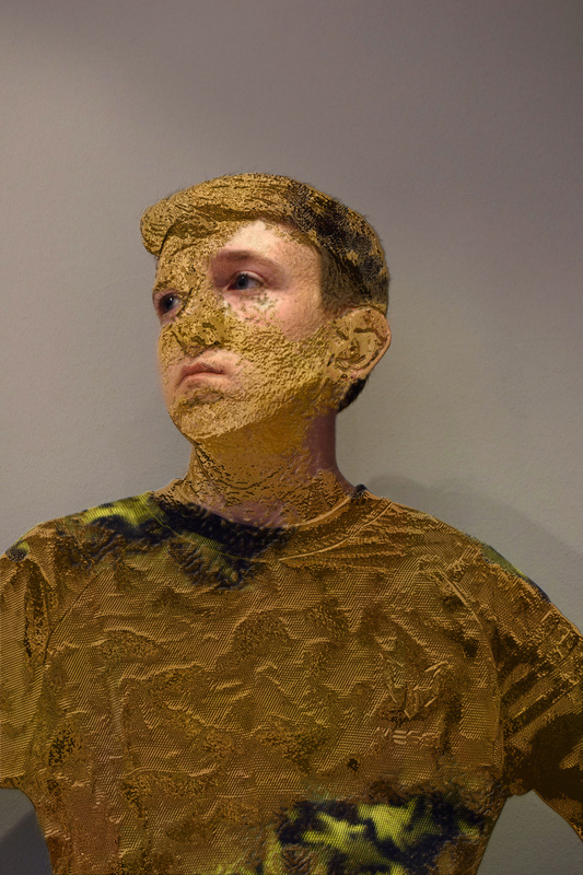
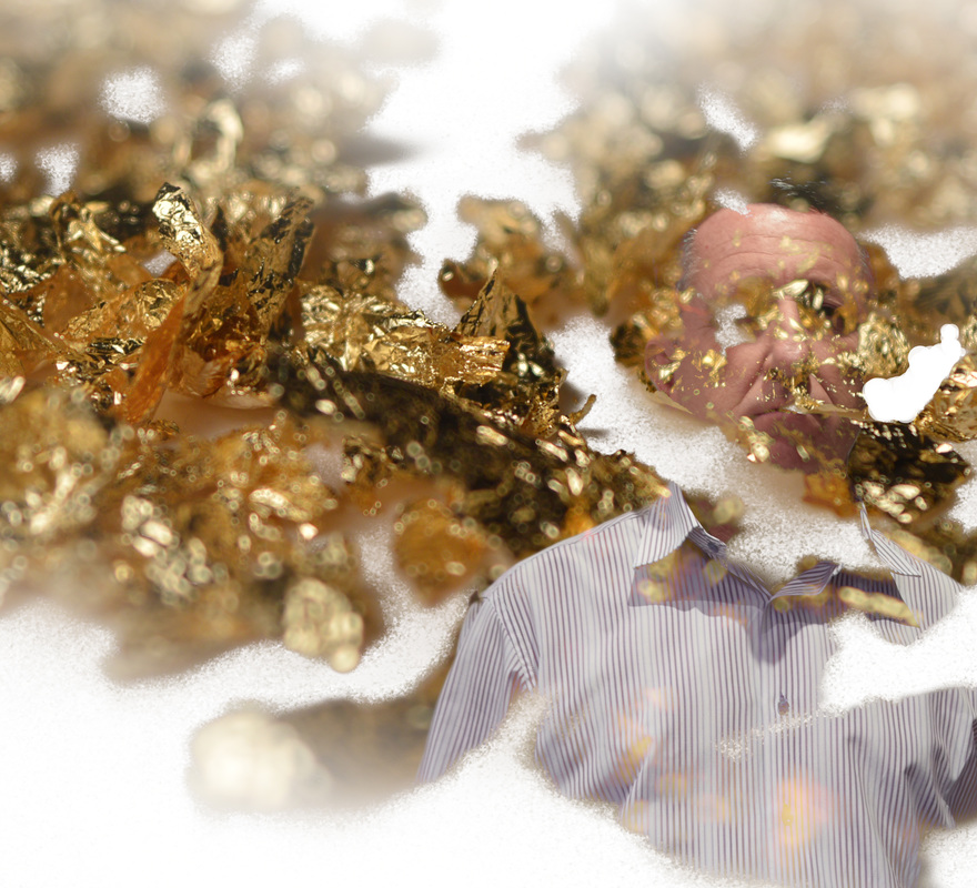
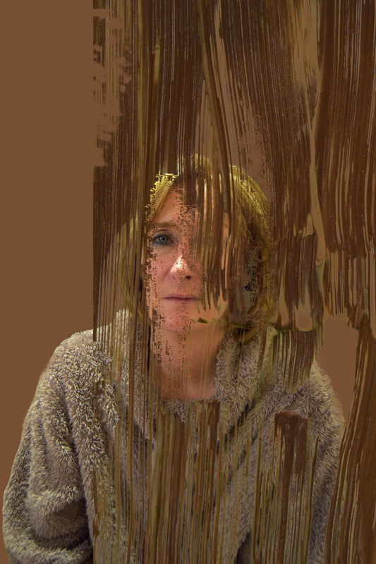
Experimentation with Gold Leaf
Here I have manually applied gold leaf to photographs. This has given me ideas about my final piece and the possibility of applying gold leaf to my final outcome. This will link with the idea that as a society, we mould icons and create social beliefs around them. The physical application of the golf leaf links to the sort of "moulding" of a person that society do; we create these icons and create the social beliefs surrounding them, just like I have created these images here. From doing this experiment, I am starting to think of my final outcome of this project and how I can make it very unique; using materials such as gold leaf, and maybe even paint, I will achieve this individuality.
|
|
Conversation Between Digital and Manual Editing
When digitally editing the photographs with gold paint, I can manipulate how the viewer sees them. I can use just the simple paint tool, but I can also use different 3-D effects to make it seem more real and life-like. For example, the chrome effect make the subject literally look like a sculpture that I have created, and in some ways, I have. I have created the way that subject is going to be seen and perceived, just like society create how an icon can be seen or perceived. Digital editing allows me, as the creator, to get into the details and really refine how things are created. On the other hand, when manually painting the gold leaf onto my pictures, while I did have a lot of control as to where I painted, I couldn't get into as much detail as I wanted. Gold leaf itself is a very messy material to use, it flakes away very easily which meant it wasn't easy to use. However, the fact that it 'flakes away' links to how an icons status can simple 'flake away'. Icons can be forgotten very quickly as society move fast in terms of trends, so the actual material I used can link to this.
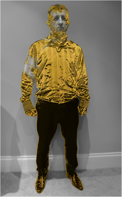
More Experimentation with Gold Chrome Editing...
I decided to do more chrome edits, because not only do I like the edits visually, the idea of building someone and creating how they look and how they are to be perceived links to my overall idea. As a society, we are the ones that build icons up into who they are and who we want them to be. So, using chrome, and the idea that I'm 'moulding' someone into something specific links to this. I decided to experiment with black and white because, not only does it add interest to the photographs and make them dramatic, it also represents how an icon might be trying to fight against this perception that we have created and wants to break free from what they are perceived to be.
|
|
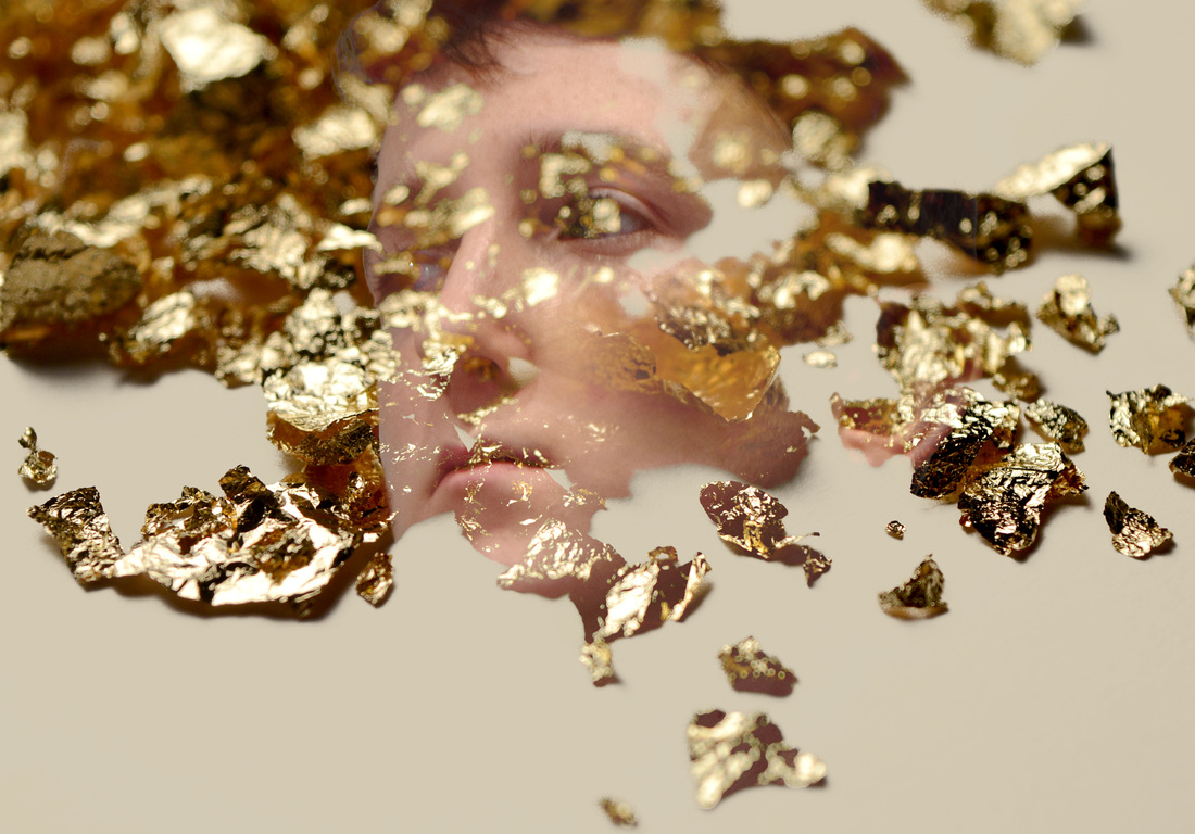
Experimenting with Gold Leaf Edits
The reason I have chosen to involve gold leaf in my investigation is so that I can explore the difference between the physicality of sculpting something and the digital manipulation too. In this experiment I have combined the two by photographing gold leaf and digitally manipulating it to create abstract edits involving portrait figures too.
|
|


|
|
Reflection of Work So Far...
After the research on Marc Quinn, I realised that I want to explore the idea of 'painting' or 'moulding' something in terms of icons and what makes an icon. The Borsi response allowed me to actually use the paint tool on photoshop which can not only metaphorically link to the idea of 'paint' but also physically and literally. While I prefer the look of the chrome edits that I have worked on, I think the paint style ones link to my project more and how society 'paint' this belief of what makes an icon and 'mould' society into believing that people should look or be a certain way. However, the chrome style photographs look as though it is 'taking over' the subject's body. This can be linked to the 'glamorisation' of an icon and how the glamour can take over a person's life and how they are as a person. After thinking more about social icons in this section of my project, I have decided that I do actually want to use personal icons, such as my family and friends, instead. This will make the project more personal and unique to me. I can assess how each person in my life makes up a different character, and add different things to my life and makes me as a person.
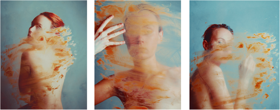
Januz Miralles
Below are some examples of Miralles' work. He turns studio portraits into abstract images by his use of paint and photo manipulation, creating a very dramatic series of photographs that definitely leave an impression on the viewer.

|

|

|
Formal Analysis On Janus Miralles
Janus Miralles is a visual artist from the Philippines. Although not a lot is known about the artist himself, his work can say a lot about what he is thinking and what he is portraying too.
Miralles creates his work through painting, drawing and also photo manipulations through photoshop. He takes portrait photographs, mostly close-up head shots, but also a few full body shots, and adds paint to them to create a distorted look to them, making the paint look as though it is fading away or, in some cases, exploding. Miralles uses both dull, dark paint and also bright coloured paint, this adds variation to his images and creates different moods and atmospheres. To start with, Miralles' images are shot in-studio, technically accurate photographs, which he then turns into abstract works from using paint. This will need to be reflective in my work, in order to gain the same, technically accurate photographs.
Miralles' intentions for his own work was to explore the beauty and the fragility of the female body. His work has been described as though his subjects are "descending" into another world; this could relate to my investigation in the fact that the "world" in which icons live is completely different to that of ordinary people. Icons are seen to be these beautiful, untouchable beings, when intact, they are just like everybody else. This is where the fading or exploding paint can show how the glamour of iconic figures slowly fades, or breaks away over time.
Miralles' work links to my project because I am investigating this idea of the glamorisation of the an icon and how the icon themselves can be forgotten easily, because as a society, we are fickle. Adding on to this, I am also looking at the idea of something being obscured, or something that can't fully be seen in terms icons, so Miralles' work can really tie in with this with his use of paint, because like his work, when something is being obscured, its like its being "painted" over.
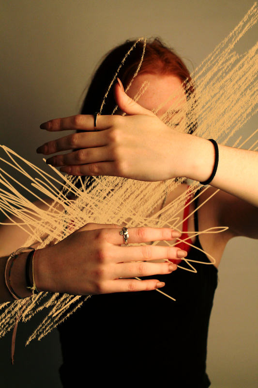
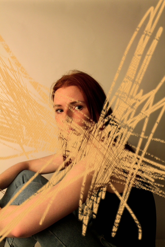
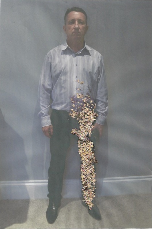
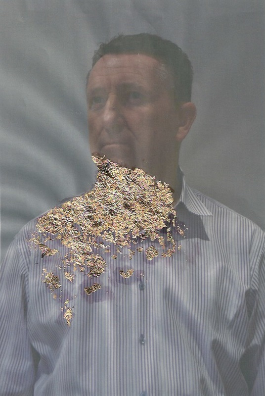
Practical Response to Janus Miralles (Work Towards Final Piece)
The main focus of this shoot was to experiment with the idea of paint. As I am thinking about using paint in some way for my final piece, I wanted to experiment with different ways I can use it and the many different ways it can look. I used a gold-ish kind of paint to mimic the gold I used in my digital edits, I did this so that the paint can still tie into the glamour side of my project.
|
|
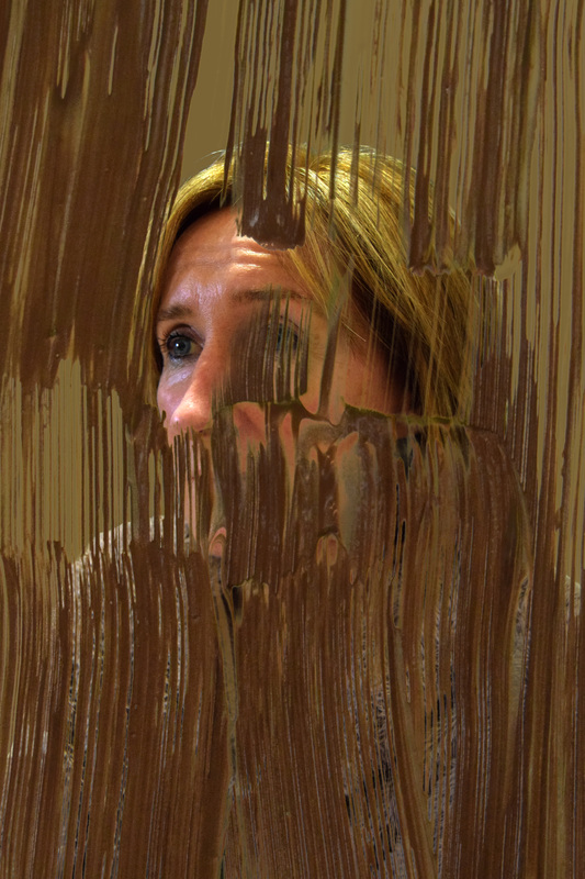
Miralles-Style Edits: Ideas Towards Final Piece
In these edits, I have layered the paint images onto a portrait of my mother. The idea of layering brings up the idea of concealing again and how an icon might conceal their true identity, or their true feelings. It also links to the idea of moulding or creating something as well. As I have created these edits, and I have used such an abstract material such as paint, I have moulded the perception of my mother, I have even literally covered aspects of her face and chosen what and how I want this to look. Once again, this adds to the fact that society create social beliefs around an icon.
|
|
Reilly
Reilly is a collage pop artist that combines iconic elements of the ancient world with modern pop culture. He uses greek statues (an element that I am looking at within my project) and combines cuts out sections and replaces them with a section of a well known celebrity from modern society. To me, his work symbolises that fact that although society might change who they iconise, we will never change the fact that we always need to have some sort of iconic figure. As a society, we are always looking or someone to look up to or lead the way. This might be because we're too scared, or self-conscious to read our own pathways and think and do things for ourselves.

|

|
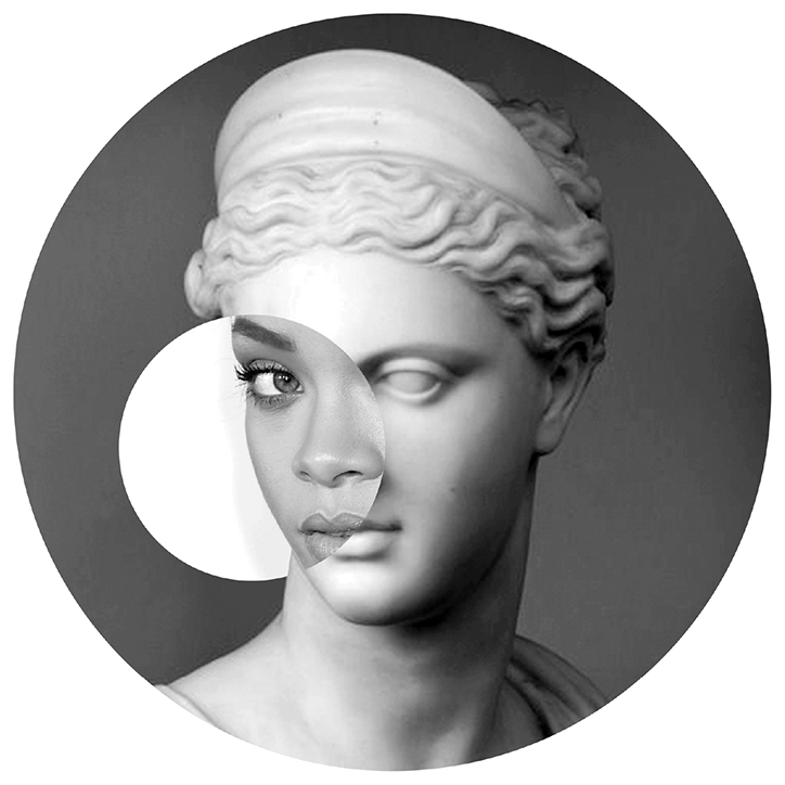
|
Practical Response to Reilly: First Shoot
In this shoot it is evident that I have played around with the lighting to experiment with the type of image I wanted to achieve. I also allowed my subject to pull a range of facial expressions so that I could experiment with the greek statue I paired the photograph up with. This was also the case with the different angles I shot from. Next time, I would like to photograph more images into or to create diversity within my project.
Practical Response to Reilly: Edits
The Reilly style edits that I have produced can be seen as successful because I believe I have done a good job of matching both the photograph of the greek statue and the photograph of my subject. I like how the backgrounds of each of my photographs are different, it makes the difference in photographs more obvious and makes the edit as a whole more interesting. Both the photographs that I merged together are in black and white; however, I made the tones slightly different to add diversity to the photographs and, again, make the difference more obvious. Although Reilly doesn't use bright coloured borders in his edits, in his other work he uses bright colours to emphasise the pop culture that he investigates. I thought this would be an interesting element to add to my edits because I am investigating this idea of iconography within society, which can be linked to mainstream culture and these vibrant colours can therefore show that. The lining up of the pictures aren't perfect in all of the edits; however, this emphasises the fact that no one really is perfect, not even the icons that we idolise.


|

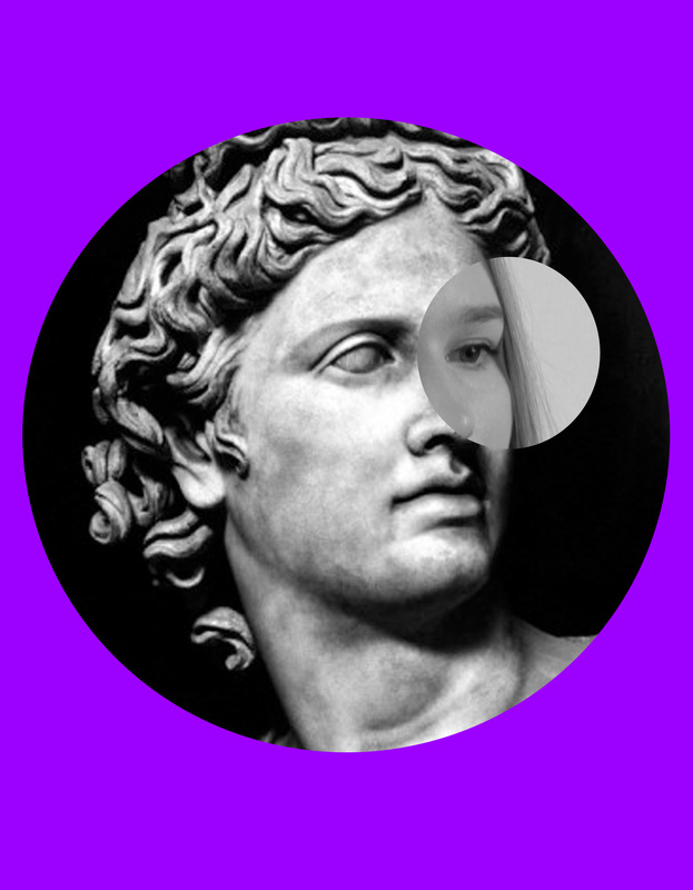
|
Research on the 4th Plinth

The 4th Plinth is the north-west plinth in Trafalgar Square in Central London. Originally, it was made to hold an equestrian statue of William IV, but due to insufficient funds it remained bare. Now, it continues to hold different statues created by different artists for all members of the public to see, which is why it has become such a famous aspect of London. It once held Marc Quinn's 'Alison Lapper Pregnant'.
The 4th Plinth ties in with my project on 'The Iconic' because the plinth itself has held, and will continue to hold iconic figures and statues in London. The idea of something, or someone, physically or mentally being put on a pedestal or a plinth is something that links to my project because society are the ones who decide who they see as these 'higher beings' and look up to them, then the icons have to deal with the pressure of being looked at and scrutinised by society.
Not only does the concept of the 4th Plinth relate to my work, but this research has also provoked some layout ideas for my final piece. I am planning to have the images I produce as large prints and hanging off the walls. I am going to make sure they are high up so that my audience have to physically look up to them, making them seem like a go-like figure, or supreme being. The fact that my audience will have to look up will show that 'The Iconic' are not only physically influential, but emotionally too; people look up to icons, which is an idea that I want to come across in my work. This will emphasise the 'statuesque' quality I want my photographs to have.
Reflection on Work So Far...
While Miralles allowed me to further my investigation on the 'paint' idea and gave me more ideas for my final piece, the response to Reilly made me realise that I want to incorporate the actual idea of statues into my work, and the thought of literally 'putting someone on a pedestal'. The 4th plinth research adds to this because it links to the fact that society decide who they iconise and view as these higher beings, which is like the statues on the 4th plinth. These more recent artist have allowed me to gain a clearer vision as to what I want my final piece to be; I want to aim to get my subjects in a studio setting, holding strong, stern poses (like greek statues) with paint dripping, or decaying away from them. This will relate to the idea that while these icons might be glamorised by a certain, they slowly start to fade away into the background, and we see that they are just normal, everyday people, that could crack under the pressure of being so influential to a person. We, as a society are very fickle, we move on very quickly, so the types of people we iconise changes very quickly too.
Matt Lipps
Matt Lipps is an artist who's work with collaging has intrigued me most. Throughout his work, Lipps gives a second life to those who have passed away, with specific interest in the faces and bodies from glossy magazines that many within society seem to idolise. The reason I have chosen to take influence from his work is because I want to bring out this idea of "eclecticism" that I brought up before when thinking about presentation in my Borsi response. The idea of having a small collection of special things links extremely well with my project as I am looking at the way a small elite of people, such as the iconic, can be grouped and idolised.


Practical Response: Edits
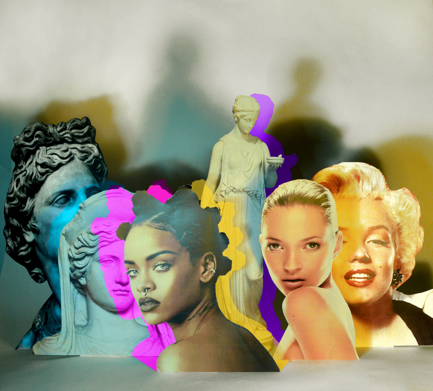
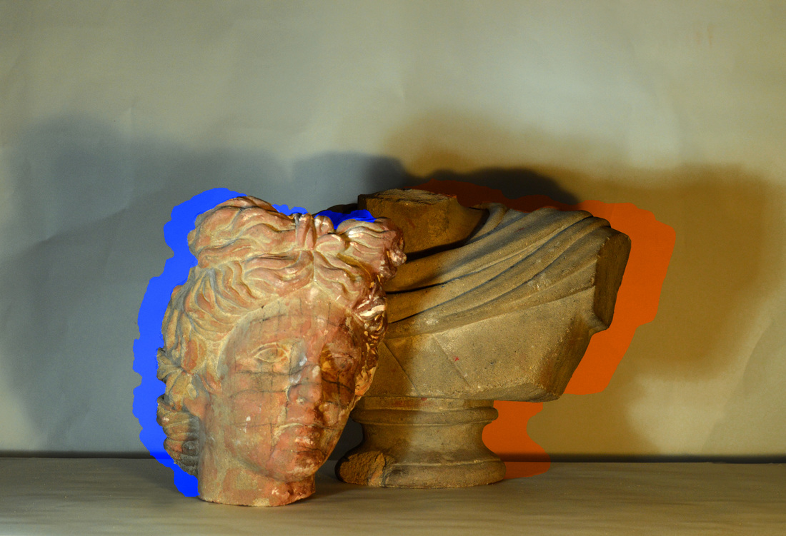
Merging Artists
Mark Quinn
Technique Quinn has made a sculpture of one of the most well-known fashion icons in British society. The fact that the statue is quite literally 'man-made' relates back to the contextual side of this work. In one statue, Quinn uses gold material which creates a sort of supreme being. He also used white material, this symbolises the purity if this being. Content Throughout this series of work, Quinn addresses society creating beliefs for themselves. This is a concept that I can link to icons within society, in terms of glamorisation; society make up what is beautiful and what is not, all of these views are beliefs that have been created, no 'set rules/guidelines' have been made. The distorted pose and the fact that the statue is man-made can link together quite well. Both of these aspects symbolise the fact that society almost shape and mould people into who they want them to be; society perceive what they want and create assumptions as to what these iconic figures are like. |
Januz Miralles
Technique Miralles uses tight portrait frames and are extremely accurate in terms of the technical side of things. His editing varies in style but they all give off the same sort of concept. Overall, the style is fairly similar throughout the series, with the subject being black and white and the edits being brightly coloured; this creates an interesting juxtaposition in the photographs. The lighting is bright, creating a sort of glow, or an angelic effect to the photographs Context The interpretation that I take from these photographs, in terms of my investigation, is the fact that icons within society can be 'painted' over with all this glamour; however, this eventually becomes boring to people within society. The glamour slowly fades or melts away. You could also relate these photographs to the feelings of the icons themselves; by being painted with al this glamour and fake beliefs, they can start to go slightly insane, so the editing could symbolise their sanity slowly disappearing or deforming. The edits can also be perceived at something being covered up, or slowly revealed; this would refer to an icon's private life and how nothing can truly be secret. |
I feel as though these artist are effective to combine because they both, in some way, address this idea of glamorisation within society and things, in terms of iconic figures, being covered up or distorted. In terms of concept, I would say both artists are equally as effective; however, with my technique, I am going to use Miralles as an influence more than Quinn. This is because I like the use of black and white images, but I also want to experiment with bright paints, or even other materials outside of the photographing and editing process.
Paint Edits: Ideas Towards Final Piece
These edited images work as ideas towards my final piece, because I am practicing the idea of layering paint within my edits. This type of work also links the physical layering of paint I am going to entwine with my work. Both the manual and digital layering/editing of paint links my idea of obscuring an icon, and covering them up with glamour. The break down look I will make the paint have will represent the deterioration of an icon and their glamour, and how they might crack under the pressure of living up to expectations.
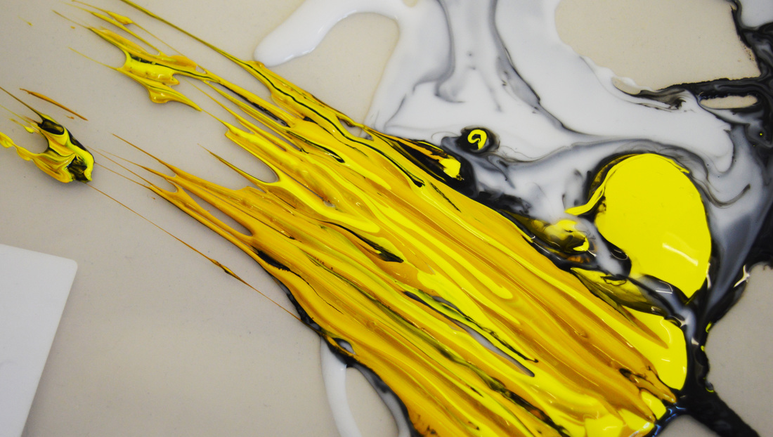
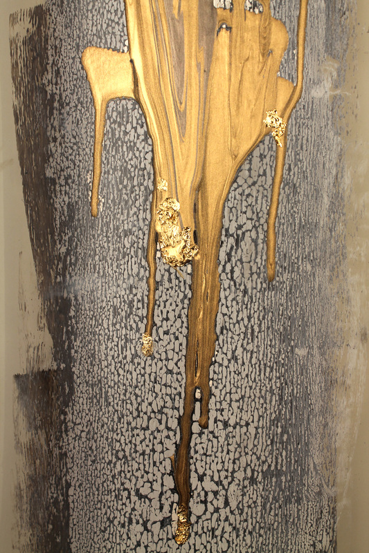
|
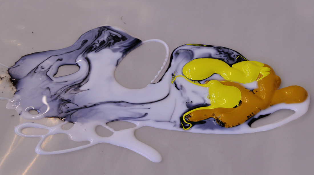
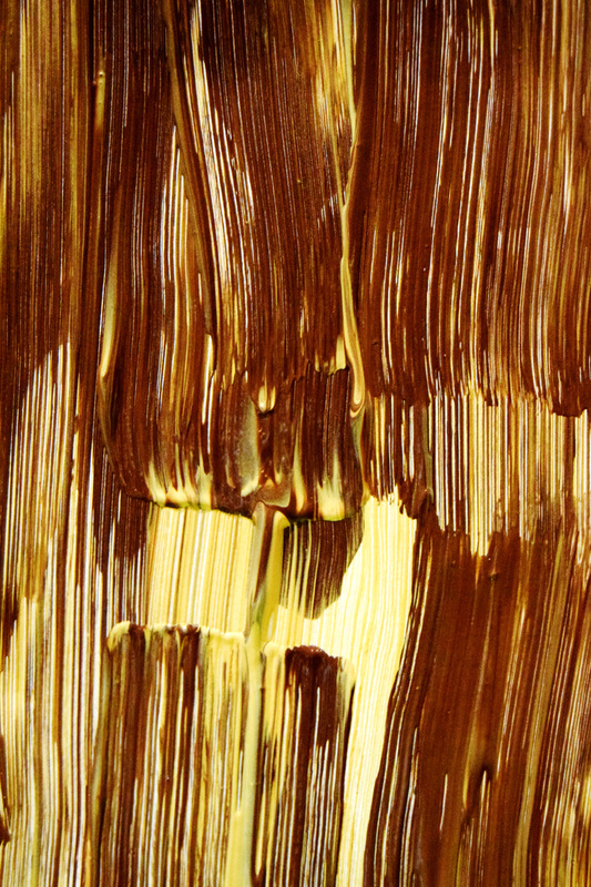
|
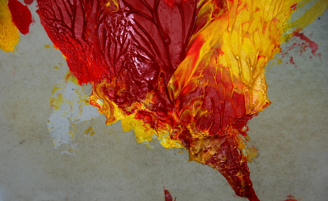
Contact Sheet for Final Outcome
Here I have photographed my family; these are images I want to use in my final piece. I have used my family as subjects because I am investigating personal icons and the different people within my life. The edits I am going to produce with these images will represent how my family might not be able to cope under the pressure of being idolised by me, as I look up to these people within my life. It is evident that I have experimented with the lighting and allowed my subject to hold different poses. This creates a sense of individuality. Although I am the one creating these images, there is still an element of their own characteristics peaking through.
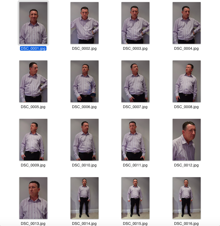
|

|
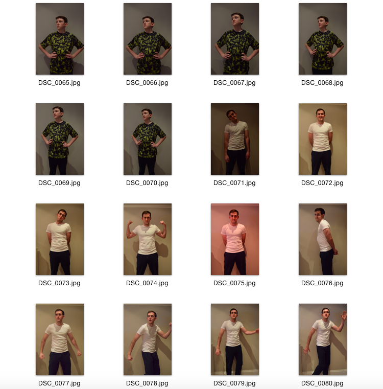
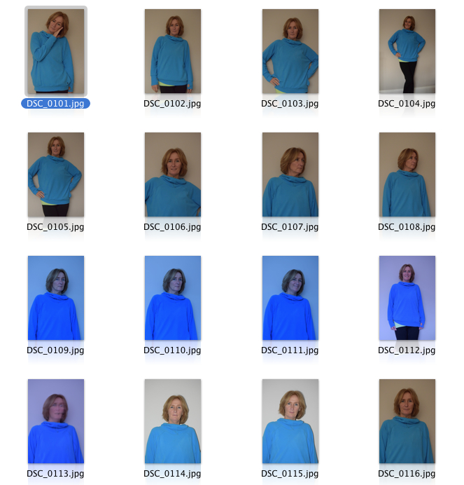
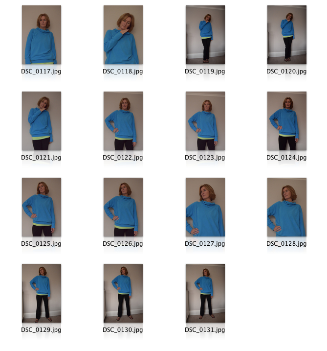
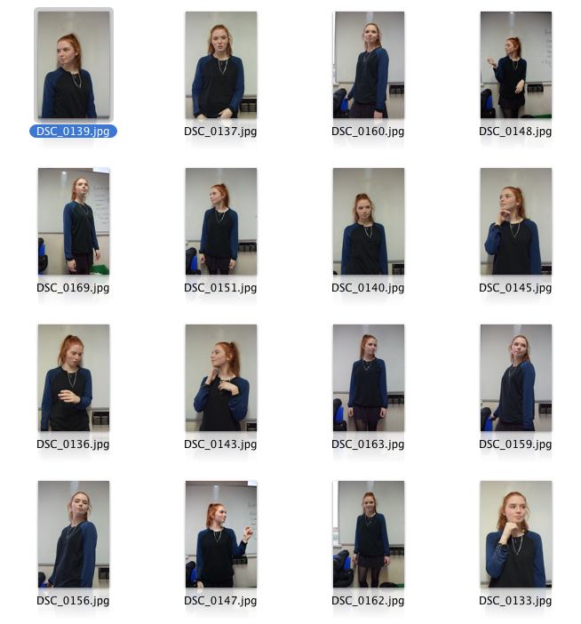
|
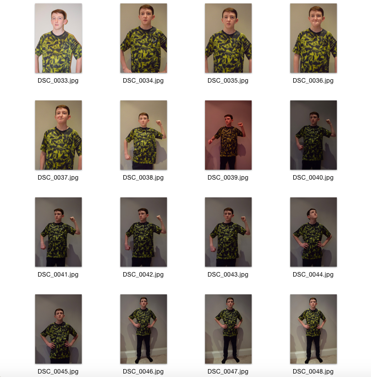
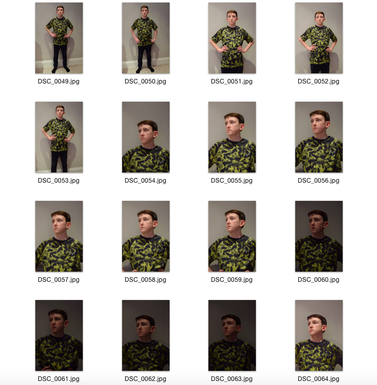
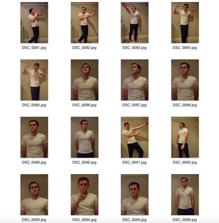
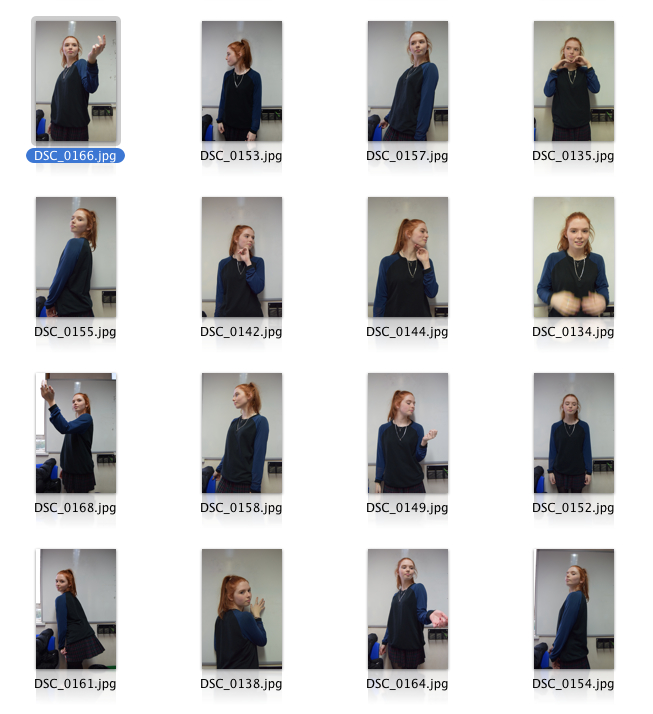

|

Final Outcome (Layout)


|

|

|

|
Final Piece Evaluation
For my final piece, my main idea was to explore the idea of iconography among society, what makes an icon and the glamorization of icons. I was also exploring the fact that with icons come social beliefs. This idea first came about when I looked at Marc Quinn; this artist was a large turning point in my investigation and spurred on many of the decisions I made after that. While Marc Quinn was a main influence throughout my project, Flora Borsi’s ‘Iréel’ and the work of Reilly also inspired me for my final piece too. The gold element to my work is evidently from Marc Quinn, while the idea of paint and obstruction comes from Borsi and Miralles. The use of circles is inspired by Reilly's pop art work that he did with celebrities and greek statues. The greek statue element of my work was thought about at the mid-stages of my project but was really enhanced by the work of Reilly. It is interesting to see how my idea changed from the start; as to begin with I was looking more at social icons within society, before moving on to the more personal icons within my life. At the beginning, I struggled to narrow down where I specifically wanted to investigate; however, by taking influence from many different artists, I became confident on where I wanted my project to go. The gold aspect of my photographs link to the glamorisation of these social figures that we look up to, but then the idea of 'paint' and more specifically 'decaying paint' is shown by the dripping paint aspect of my images. Both of these elements together form the idea that the glamour of an icon soon fades and drips away, because we as a society are very fickle. It also represents how one might 'crack' under the pressure of being an icon for someone, and how its difficult to live up to certain expectations. The use of the circles create the idea that we only get a small glimpse into an "icon's" life and so we are getting a peak into what seems like the real person behind the layers of paint, obscuring the real them, leaving us only with how we created them. I thought this was interesting because when using Photoshop I am literally creating layers and building things over the original picture to obscure it which links to my original idea. To add to my digital edits, I am going to have my photographs blown up on large paper to emphasise the ‘statue’ element of social icons, and how they are put on a pedestal and looked up to both physically and emotionally. The idea of 'looking up to someone' will be emphasised when my final edits are hung up on a wall and my audience will physically have to look up at them. I will then pour paint on the blown up images and allow it to drip off the picture, onto the walls and then to the floor. This represents the glamour that we paint icons with and how we mould or paint them to be this perfect being that we almost worship. I think this is the most successful aspect of my final piece because it makes it stand out and adds a materialistic element to it, just like certain icons in society might be seen as materialistic. They are no longer just photographs; they become real and physical, just like these social icons are real people with real everyday lives.
This investigation has taught me that I need to make my ideas clearer and narrow them down more. While its good that I might have a lot of ideas, it can become confusing for both the viewer and myself. As a whole, I think my final piece communicates my idea well. It brings together the breaking down of glamour and the fact that as a society, we create beliefs about these people and automatically create a higher status for them. I have communicated this idea both physically and mentally within my outcome, and I am pleased with the end result.
This investigation has taught me that I need to make my ideas clearer and narrow them down more. While its good that I might have a lot of ideas, it can become confusing for both the viewer and myself. As a whole, I think my final piece communicates my idea well. It brings together the breaking down of glamour and the fact that as a society, we create beliefs about these people and automatically create a higher status for them. I have communicated this idea both physically and mentally within my outcome, and I am pleased with the end result.
